Genoa Empreendimentos is a company with values closely aligned with the everyday experiences of its team.
Its developments consistently include features designed to make residents’ lives easier, prioritizing high-quality materials and exceptional workmanship.
Given this context, I needed to develop a digital marketing structure aligned with the company’s reality. My goal was to align the brand’s verbal and visual communication to clearly and effectively convey its mission of transforming people’s living experiences.
93% of people in Brazil search on Google before buying
Data from State of Search Brazil
Deficiencies in customer touchpoints can kill sales opportunities
The company has a market history marked by providing third-party services during its early years, which allowed it to develop comfortably with the few marketing resources it had.
However, this reality changed as the company redefined its future objectives. Shifting away from providing services to others, Genoa began focusing on building its own developments. This change required closer relationships with end customers to facilitate sales, unlike the B2B model that relied on other companies.
In the new sales model, investing in the company’s public image became essential for sustainable growth—something other companies are also doing.
Website development
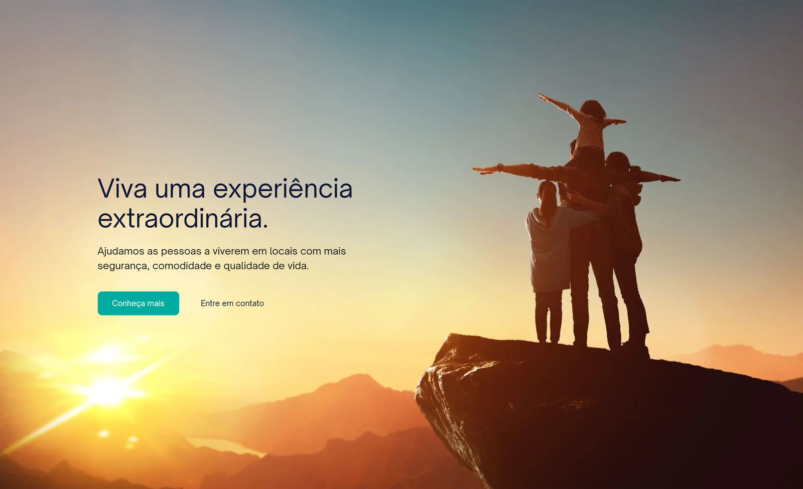
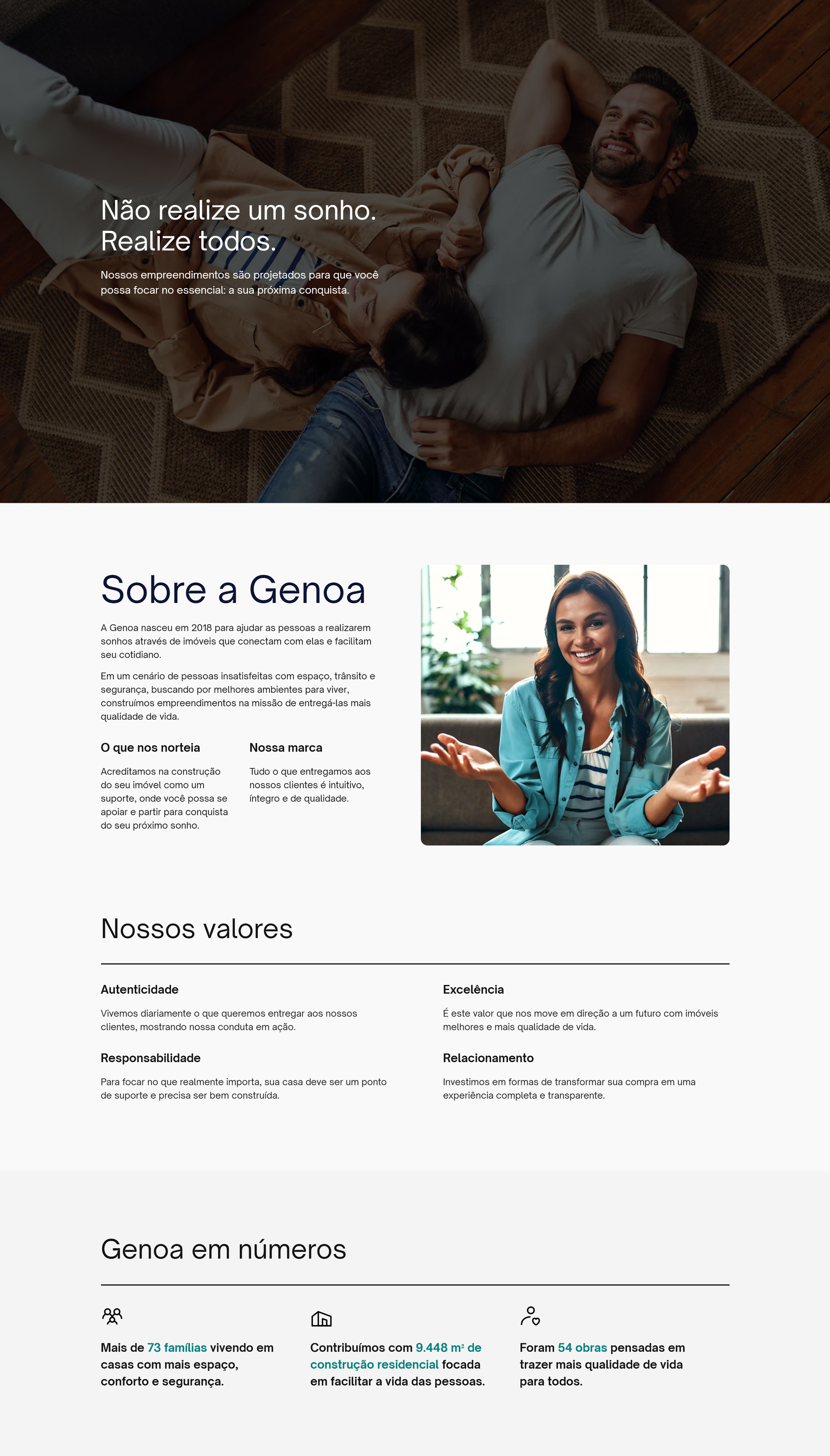
From my conversations with the company’s owner, I understood that the ideal communication style for the target audience should be more conservative, both visually and textually. This approach took into account the social and cultural aspects revealed during the market research I conducted at the beginning of the project.
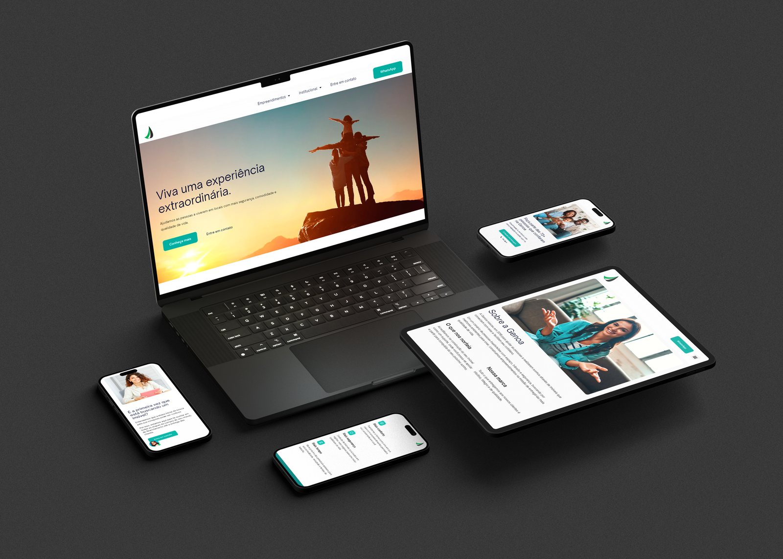
Based on this, I created a proposal that completely redefined the business’s digital presence, comparing it to the outdated website they previously had.
Architecture/sitemap
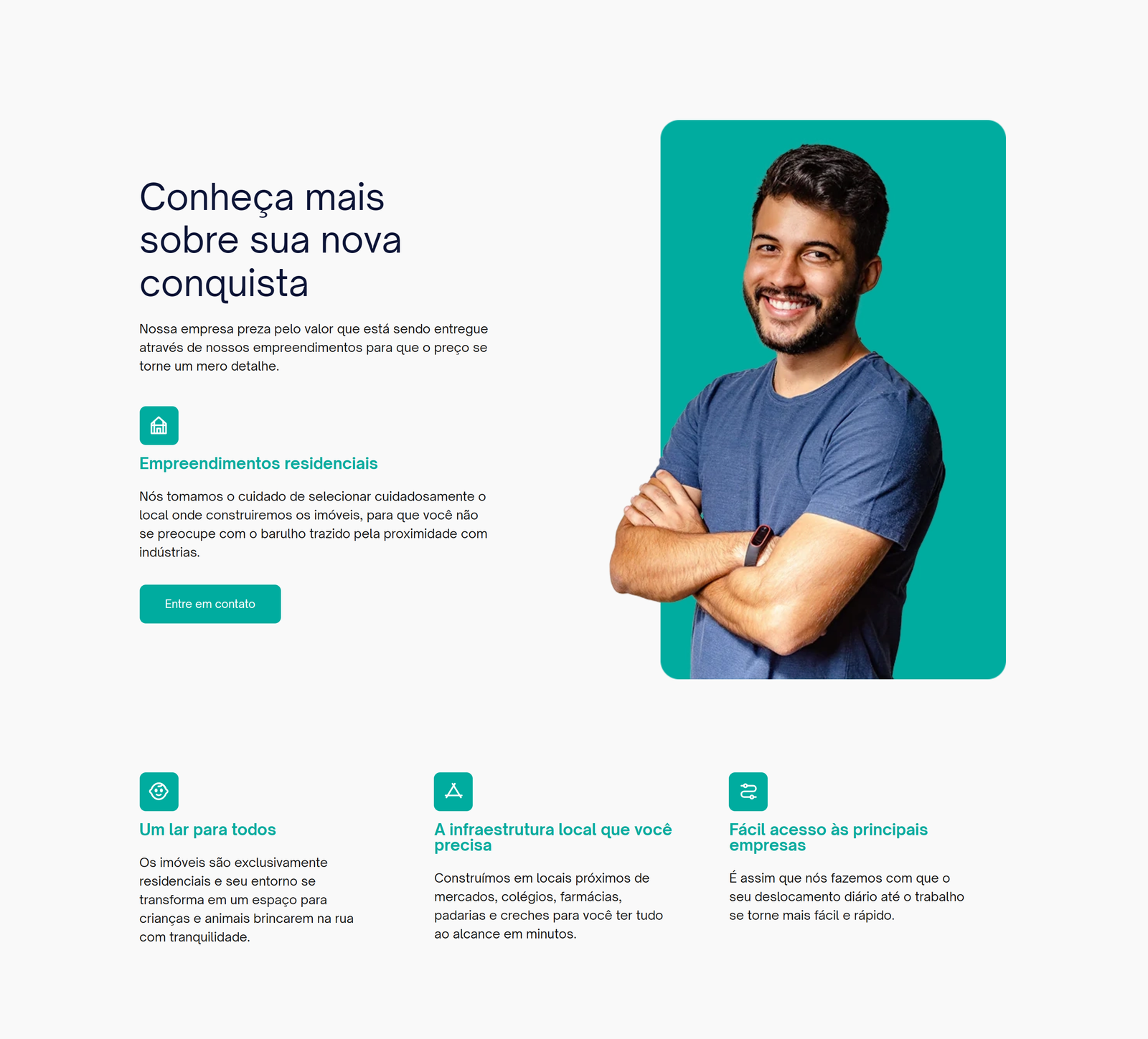
I designed the site’s page architecture to make the user experience simple and intuitive, enabling visitors to quickly find the information they needed within seconds.
The visual layout followed the same principle, taking inspiration from designs used by companies like Nubank and Adobe.

Technical SEO: why to include “Cities of operation”?
One of my key strategies was developing dedicated pages for each city where the company operates. For example, when someone in City X searched for “construction company in City X” or “real estate in City X,” (but using their native language) the website would appear in the local search results.
This targeted approach can be extremely effective, as people could find exactly what they were looking for in their specific location and this kind of results tend to look more attractive, real, verifiable, easier to reach and more trustable.
I made sure to set up a clear URL structure, built up authority across different pages, and connected related content throughout the site – all based on my firsthand experience as a customer of one of the construction companies I’ve worked with before, plus the valuable insights I gained from extensive research talking to realtors, entrepreneurs, and employees in the construction industry.
CMS choice
WordPress was chosen because ease of content management by the company afterward was essential. Considering that the marketing team was something to be implemented in the future, anything that could be done to make these content management tasks easier would be worthwhile (at least, reducing the entry barrier for a new employee when compared to how difficult is to learn other CMS).
Security
Well, every company expects their communication channels to be functioning practically all the time. To assist with this, I made a selection of reliable hosting on servers in the company’s own country, in addition to implementing additional protection against DDOS attacks and similar threats.
Creation of pages for paid traffic
Pages for the company’s developments were created following a predefined content structure. Each page was designed to function as a landing page, optimized for use in paid media strategies.
This approach made the company’s site faster, as it avoided hosting additional, separate pages while simultaneously boosting organic search traffic with richer content.
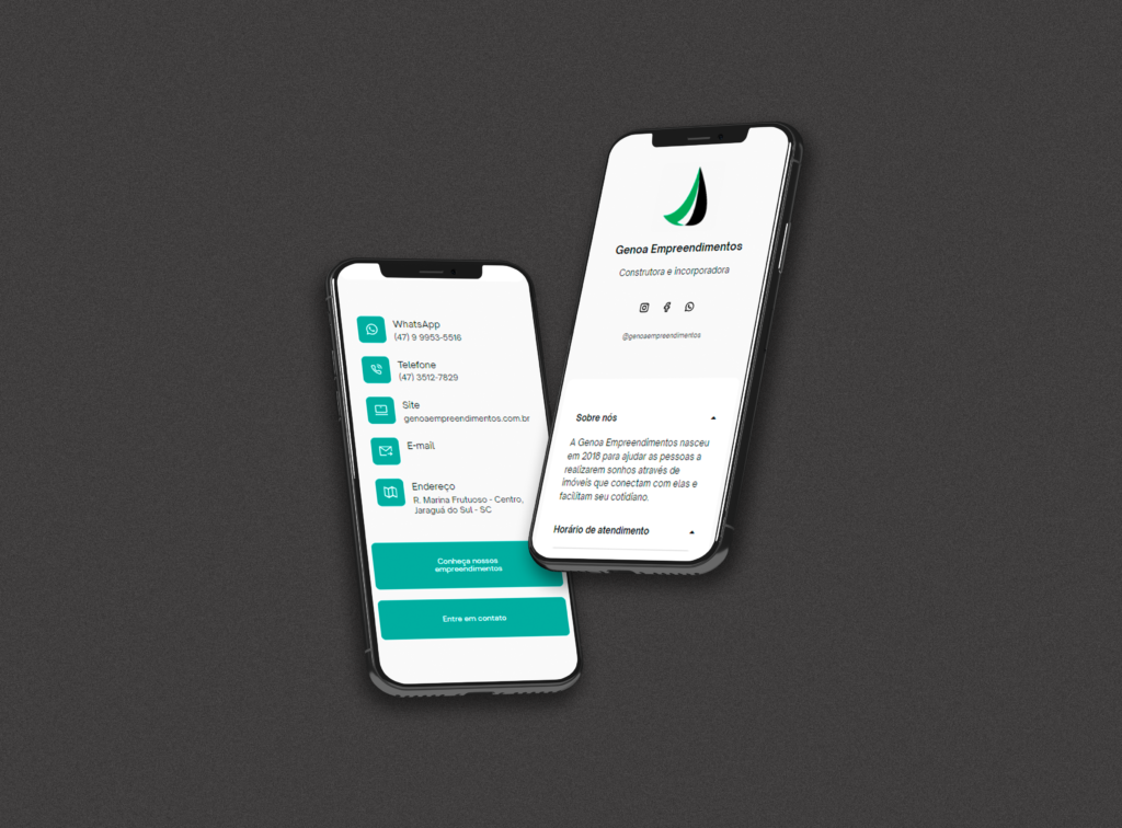
Social landing page
I also created a unified bio link page that the company could share across all their social media platforms, bringing together their main contact information and website links in one place.
It was made responsive, so it works smoothly on any device. When someone visits from a computer, they see a QR code they can quickly scan with their phone to open the company’s WhatsApp – a feature I intentionally hide on mobile since users are already on their phones and can tap to connect directly.