

The variety of options in the market is a factor that increases competition between companies and makes people more demanding about the products offered by brands, especially in the high-end segment.
In this context, CSete was going through a transition in its market positioning, aiming to build high-end developments with high added value in the best locations around the city of Jaraguá do Sul.
By targeting a financially empowered class, not only the quality of the products needed to improve, but the entire context surrounding the brand also had to be developed with a concept.

Expansion of the CSete brand
With the knowledge of the need to make the brand image consistent with the products and the target audience, CSete sought out me to deliver a premium project that would spark people’s interest in getting to know them.
People no longer want a property, they want CSete.
— Employee’s statement during an interview.
Company diagnosis
Every decent branding project starts at this stage.
I performed a complete documentation on the company’s scenario in relation to its market and competitors, aiming to gather as many points for improvement as possible.
During this process, I held meetings with the founder and also with employees, collecting information about the company’s daily operations.
This was done so that CSete could quickly leverage the quality of its product and the relationship with its clients.
Challenge
The previous brand identity communicated with a different audience than the current one. The target audience was not in the high-end segment, so the verbal and visual universe of the brand was composed of characteristics that no longer fit the new market positioning.
However, before people can purchase a product, they need to know it. It is possible to attract them through the new visual identity and structuring of the social media profile.


Brand positioning
The company revolutionized the concept of high-end real estate in the region, in a market previously characterized by slow adoption of technologies for a group of people who were eager to pay for innovation in their daily lives.
I aligned this context with the vision of Clesio, CEO of CSete, and developed the brand description, highlighting how they see the world, their beliefs, and value proposition.
It is now easier for the company to distinguish itself from the competition.
Visual identity
Creation of the new logo
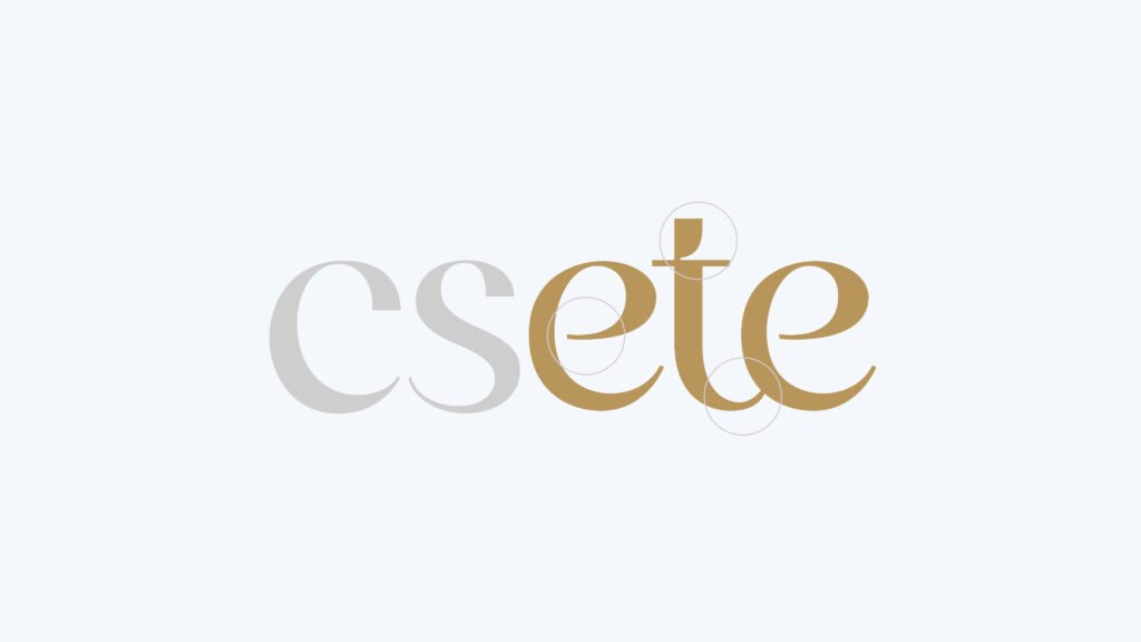
The font features curves that simulate human handwriting, forming a modern and elegant signature.
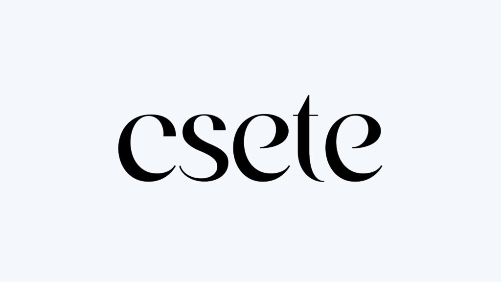
The designer applied an intervention to the font, bringing more personality and exclusivity to the brand.
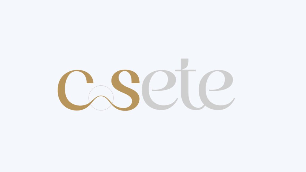
By merging the letters “c” and “s,” a curved bridge is formed.
A bridge is a link between two separated spaces; in this sense, the bridge is a widely recognized symbol of connection and mediation.
The gentle movement demonstrates trust and professionalism involved in each project of the company.
Bringing sophisticated elements and colors
This goal was achieved through a palette of gray tones combined with gold. A memorable brand attracts attention more easily.
We don’t need to do something flashy to get attention, it just has to be done very well.

Gallery
Care for the public image reflects quality in the products. Check more below.


